So, this post marks my first foray into opinion, and err, blogging. I think the blogging craze is just about dead, so I might as well jump on the bandwagon and be merry on my own.
I think many people will agree that design communicates. A good book cover will connect with people, and reveal the tone of the book well and a good event poster will attract the intended crowd, and so on. And this now brings me to the recent design directions of Apple and Dropbox.
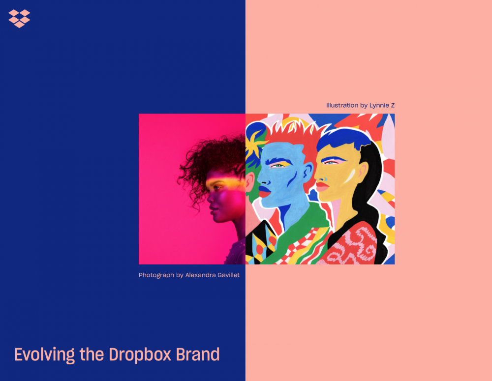
Let start with Dropbox. Dropbox is great. It’s a simple online cloud storage solution that now supports collaboration and editing. It is (or was?) a Web 2.0 company, it filled a gap in the market that was not done so by anyone else to a satisfactory standard when it first came into existence. Things are different now though. There are many providers of online cloud storage, all with equally dull but reliable and predictable designs. With that in mind, I guess Dropbox turned to the idiom that they must change with the times. Yet, they haven’t changed, the design of the very same product changed. Clearly, someone at Dropbox thought that they could go after a new niche: designers and creatives, and to do this, all they needed was a new design.
Don’t confuse this with a new direction or product though. It’s still the same, now-ubiquitous, reliable cloud file storage service, with a collaborative editor. It’s the same product — exactly the same. So this redesign is a skin-deep modification, and in my opinion, most of the design is fine except for the images they’ve used to adorn it. They are ugly and distracting, but not as ugly as the Dropbox design website itself. Now the message they want you to hear is “we’re for creatives brah”. They’re determined to hammer home that message with hideous pictures and messages everywhere. But, of course, they don’t have the product to match. This is a wonderful cloud data storage provider and not a hive mind for artists.
In other words, their design is a miscommunication. Its selling something which they’re not. Good design is honest and transparent. Dropbox’s design direction is just bizarre and plainly untruthful. Dropbox is not a product for creatives any more than it was last month. This is a poor effort to remain relevant (which they are anyway) by forgetting their legacy. They are a cloud storage provider, not a trendy cocktail bar.
And now my gaze turns to Apple, which is a different but related situation. I love Apple products, on the whole, but something has gone wrong recently. Under Jobs, Apple showed you why its product was what you needed. They held up a product and said this is what it does, and you can do it too with no hassle. People flocked to Apple for it. The Jobs Halo was more about how Jobs showed off the message of the design, and how that connected with people. The Apple of today now bizarrely justifies the decisions it took with bizarre use of descriptors such as “unapologetically plastic“. They’re scared you’ll misinterpret the product for what it is rather than what they want you to think it is (or, in other words, the message is no longer clear).
Take the removal of the headphone port from the iPhone 7 as an example. If you make a product and say that you are courageous in making it, you’re telling people the message before they’ve made their mind up. You’re communicating on behalf of the design and not letting the design speak for itself. By all means, show it off, make people see the wonder, it’s what Jobs was so good at. Today, Apple is acting like the person that has been caught doing something wrong and starts spewing out excuses. They sound desperate, cheap, and money grabbing.
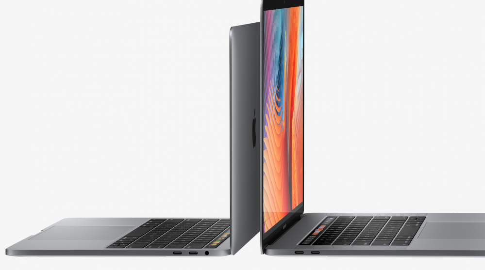
If you make a phone without a headphone port and call that “courage” but make another product one with, does that mean you’re not courageous with it? The dictionary on my MacBook Pro says that the opposite of courageous is cowardice. So Apple, are you cowardice with the MacBook Pro?
Apple spoke for the design instead of letting the design speak for itself. If you make using headphones with an £800 phone cumbersome, and then sell something for £150 that makes it easy, you’re saying you want to make money (Apple is a business after all). Sure, wireless is the future. I want it, you want it, we all want it (on the condition it works well). But trying to get to the wireless world by crippling your products, making an adapter for old products, and making customers pay more is a move that says “we’re too big to care about your inconvenience”. I bet that if I went and did a vox pop, and said what do you think the message is here, courage will be way down on the list. Design communicates, and you can’t change the message that the design communicates with a press conference.
In both cases, Apple and Dropbox have set out to spread a message they want you to believe. One hideous and misaligned with their product but is done to seem cool and edgy, and one to justifiy their business practices and to make them seem like a pioneer (although I would withhold such a title from any company that makes this mouse or this keyboard). Both, in my opinion, fall short of their goals.
Originally posted at https://www.porcheron.uk/blog/a-product-s-design-speaks-for-itself
https://www.porcheron.uk/blog/a-product-s-design-speaks-for-itself